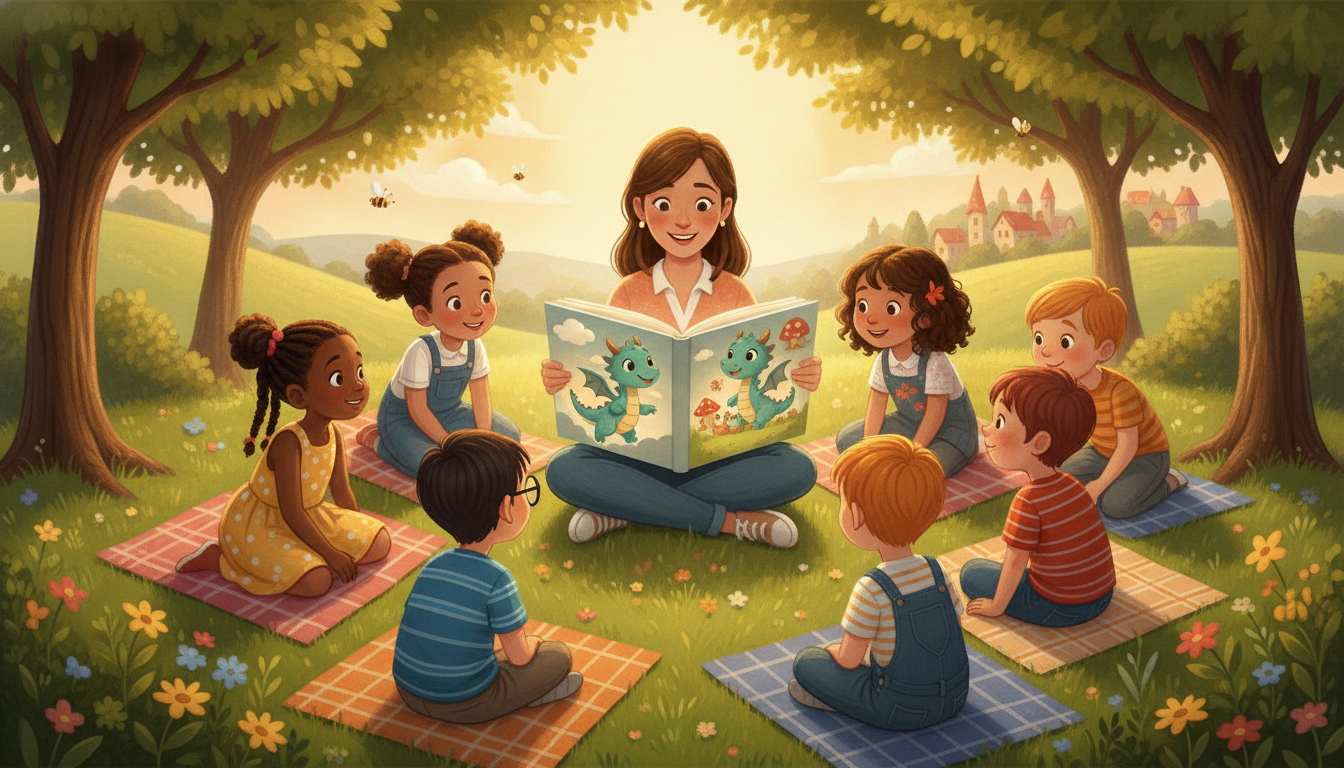
Choosing the right illustration style for your children's book isn't just about making it look nice. It's about creating visuals that speak directly to young readers, helping them connect with your story on a deeper level. The art you pick sets the tone before a single word is read. Here's how to match your illustrations to your story and audience.
Classic Watercolor and Hand-Drawn Styles
Watercolor illustrations have a timeless quality that works beautifully for gentle, dreamy stories. Picture a bedtime book where the edges of the images soften like twilight, or a fairy tale where the colors bleed together like an old storybook passed down through generations. The texture of the paper shows through, giving it a handmade feel that can make children lean in closer.
Hand-drawn pencil or ink illustrations bring a different kind of warmth. Sketched lines give characters personality, as if they might wiggle right off the page. This style is wonderful for books where the characters are the heart of the story, like a curious animal exploring a garden or a child learning to ride a bike. The slight imperfections make it feel real, something children recognize instinctively.
Bold and Bright Digital Illustrations
Digital art has opened up a world of vibrant possibilities. Books for toddlers often use high contrast colors and clean shapes because young eyes respond strongly to them. A page with a bright red ball against a green background isn't just striking, it helps very young children distinguish objects clearly.
But digital isn't just for board books. Older picture books use digital tools to create everything from sleek, modern cityscapes to lush jungle scenes bursting with detail. The consistency of digital colors from page to page keeps the world cohesive, which helps children follow the story visually. It's also easier to adjust small details without starting over, which is why many educational books with precise diagrams or labeled images use this approach.
Minimalist and Whimsical Approaches
Sometimes less really is more, especially for younger audiences. Minimalist illustrations with plenty of white space prevent overwhelming little readers. A single red house on a snowy hill can hold as much magic as a crowded scene when done well. Books teaching simple concepts like shapes or emotions often thrive with this clarity.
On the flip side, whimsical styles take exaggeration and run with it. Characters might have heads too big for their bodies or legs that stretch like taffy. This isn't a mistake. Amplifying features makes characters more memorable and emotions easier to read. A child can instantly tell if a character is surprised or grumpy when their eyes take up half their face. Silly styles also invite laughter, turning reading into play.
Matching Illustrations to Your Story's Tone
Think about how the pictures will carry your story's mood. A nighttime adventure might use deep blues and purples with textured brushes to create shadows that aren't scary but still feel exciting. A hilarious story about a mischievous pet could bounce along with loose, scribbly lines that look as energetic as the antics described.
The best test is always the children themselves. Watch where their fingers linger on the page, which pictures make them giggle or ask questions. Their reactions will tell you more than any style guide can. If they want to pet the furry monster or trace the path of the rocket ship with their fingers, you've found your match.
For those creating personalized books, keeping characters consistent across every page is key. Whether you're drawing by hand or using digital tools, that little face should be recognizable whether they're wearing pajamas or a pirate hat. Fablekit helps by providing templates that maintain character features while letting you tailor each scene to your story's needs.