When you open a children's book, the characters quickly become familiar faces. But have you ever noticed how important it is that those faces look the same on every page? For young readers, this consistency isn't just a nice detail, it's fundamental to how they connect with the story and its heroes.
Why Consistency Clicks with Kids
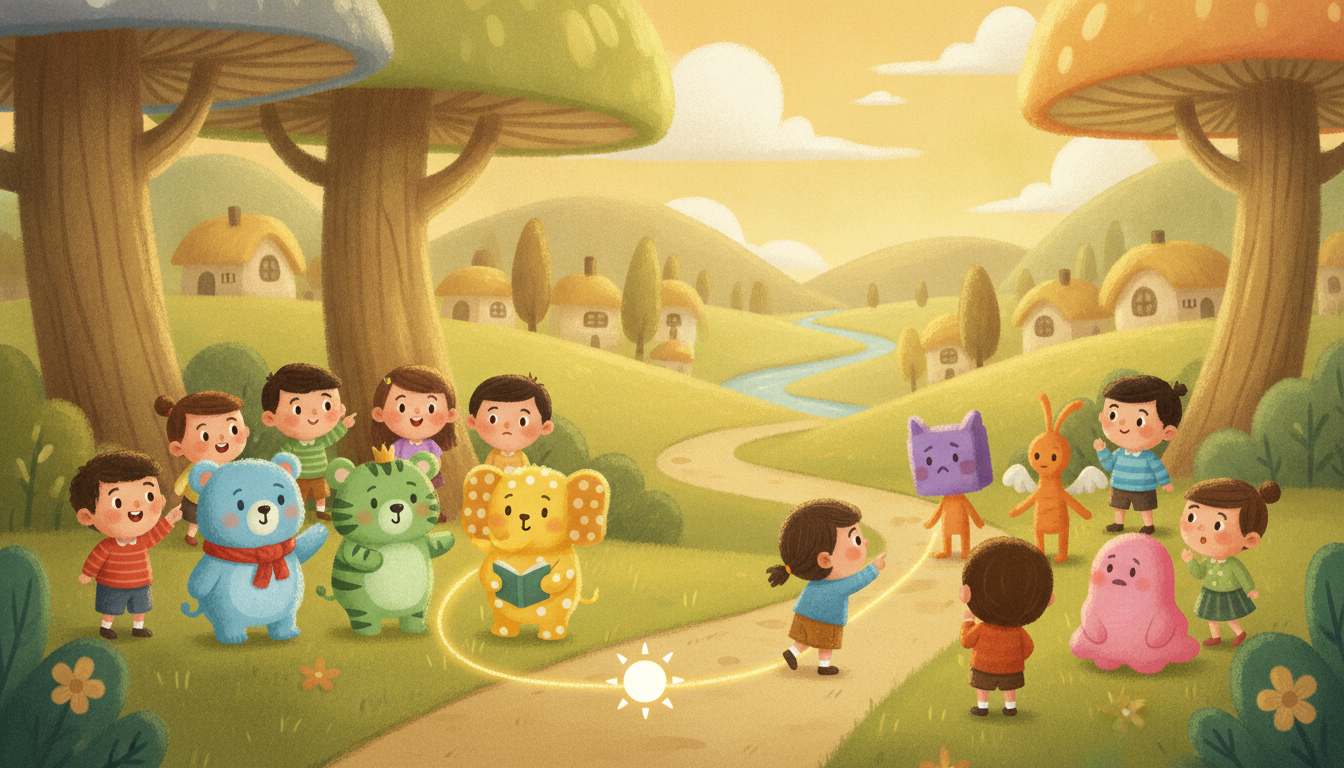
Young children thrive on predictability and familiarity. This helps them feel safe and understand the world around them, whether it's their daily routine or the story they're enjoying. A character that looks the same on every page helps children build a strong connection and recognize their 'friend' throughout the story. If a character changes appearance too much, it can be confusing or even jarring for a child, pulling them out of the story's magic and making it harder to follow along.
What are the basics of good character design for children's books?
Good character design for children's books starts with clear, simple shapes and a distinct color palette that are easy to reproduce. Think about unique identifying features, like a special hat, a distinct hair curl, or a specific expression, that consistently define your character. These elements become visual anchors for young readers.
When designing, focus on creating a character that is memorable and recognizable from any angle. Avoid overly complex details that might be hard to draw repeatedly. Many designers also consider the '70/30 rule' in character design, where roughly 70% of the character is immediately recognizable and consistent, while the remaining 30% allows for natural expression, movement, and minor variations without losing the character's core identity. This balance keeps the character dynamic while ensuring visual continuity.
How can I maintain a consistent look for my characters?
To maintain a consistent look for your characters, create a 'character sheet' or 'style guide' for your main characters. This sheet should show them from different angles, with various expressions, and any key accessories. Reference your original character drawings frequently, especially when moving to a new page or pose.
For artists working digitally, using layers and locked elements can be a huge help. You can create a base layer for your character's head or body and then draw expressions or poses on separate layers, ensuring proportions and key features remain constant. Even for traditional artists, having physical reference drawings taped up nearby can make a big difference. Tools like Fablekit make this easy by allowing you to create a character and then reuse it consistently across pages.
What is the 70/30 rule in character design?
The 70/30 rule in character design suggests that about 70% of a character's visual elements should remain consistent and instantly recognizable across all depictions. The remaining 30% allows for variation in expression, pose, movement, and slight stylistic adjustments without losing the character's core identity. This rule helps ensure the character feels alive and expressive while still being clearly the same individual to the reader.
For example, a character's basic head shape, eye placement, and primary color scheme would be part of the 70% consistent elements. The tilt of their head, the curve of their smile, or the way their hair blows in the wind would fall into the 30% allowing for dynamic expression. It's a guideline to balance familiarity with vitality, especially important when you design a kids story book.
Catching Inconsistencies Before They Go to Print
Before your storybook goes to print, a thorough review is essential. Review your illustrations page by page, specifically looking at your character's appearance in each scene. It helps to flip through quickly, almost like a flipbook, to spot any sudden changes in shape or size. Ask someone else to look at the book with fresh eyes, as they might spot details you've overlooked after staring at the artwork for so long. Pay close attention to details like eye size, mouth shape, and the placement of accessories, which are common areas for subtle shifts. A small change in an eye's position can alter an entire expression, and a slightly different hat can make a character feel less familiar.
Frequently Asked Questions
Why is character consistency important for young children?
Consistent character appearance helps young children build a strong connection to the story and its characters. It provides visual predictability, which is comforting and aids in comprehension, making the reading experience more enjoyable and engaging for them.
How can I ensure my character looks the same in every drawing?
To ensure consistency, create a detailed character sheet with various poses and expressions as a reference. Use simple, distinct features that are easy to replicate, and regularly compare new drawings to your original designs. Digital tools can also help by using locked layers for core elements.
What common mistakes lead to inconsistent character illustrations?
Common mistakes include not using a reference guide, rushing the drawing process, or making subtle changes to proportions, facial features, or color palettes from page to page. Over time, these small deviations can accumulate and make the character look different.
Should a character's expression always be consistent?
While core features should be consistent, a character's expression should naturally vary to reflect their emotions and the story's events. The '70/30 rule' suggests allowing around 30% variation for expression and movement, while 70% of their fundamental look remains the same.