Publishing a children's book — even just one copy for a grandchild, or a short print run for family and friends — has more small decisions in it than it looks like from the outside. Most of them aren't hard, but they're easy to discover too late, after a manuscript is already finished and a format choice turns out to be the wrong one.
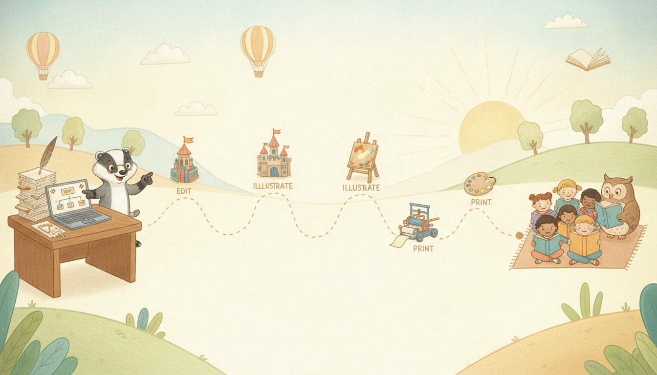
This is a practical, step-order checklist for going from "the story is written" to "there's a real, printed book." It's written for first-timers — a parent, an aspiring children's-author, a grandparent, or a classroom project — not for anyone chasing bestseller-list self-publishing tactics.
Download the one-page checklist (PDF)
1. Format decisions (decide these before you illustrate anything)
- Trim size. Children's picture books are conventionally 8×8", 8.5×8.5", or 8.5×11" — square and near-square formats read as more "picture book," rectrangular portrait formats read as more "early reader." Whatever you pick, lock it in before illustration starts; resizing art after the fact almost always means redoing compositions, not just scaling them.
- Page count. Standard picture books run 24–32 pages, almost always in multiples of 8 (a print-binding constraint, not a creative one) — 24, 32, or 40 pages. Plan your page count before you plan your page-by-page layout.
- Softcover vs. hardcover. Hardcover reads as more "gift," costs more per copy, and usually has a longer print lead time. Softcover is cheaper, faster, and perfectly normal for a personal or classroom project.
2. Text and editing
- Read it out loud, all the way through, before anything else. Children's books are read aloud far more than they're read silently — by a parent, a teacher, a grandparent — and sentences that look fine on the page sometimes stumble out loud. This single step catches more real problems than any other editing pass.
- Check reading level against the intended age. A 4-year-old's picture book and an 8-year-old's early chapter book have very different sentence-length and vocabulary norms. If you're not sure, read two or three published books aimed at the target age and compare sentence complexity directly.
- Get at least one outside read. Not necessarily a professional editor — a teacher, librarian, or well-read friend catching pacing or clarity issues before print is enough for most personal or small-run projects. Professional editing is worth the cost if you're planning wide commercial distribution; it's optional for a keepsake or classroom project.
- Proofread after layout, not just before. Typos have a way of appearing during the layout process (a line wraps oddly, a word gets dropped moving text into a template) that a pre-layout proofread won't catch.
3. Illustration
- Decide on a consistent visual style before the first page, not the tenth. The single most common issue in first-time illustrated books — hand-drawn or AI-assisted — is a character who looks noticeably different from page to page: hair color drifts, proportions shift, an outfit changes without explanation. Lock a reference sheet (what the character looks like, from at least two angles) before illustrating any page, and check every new page against it.
- Match illustration mood to story mood. A gentle bedtime story and an adventure story call for different color palettes and energy in the art, even with the same character.
- Leave room for text. If text and illustration are on the same page, plan negative space in the composition where the words will sit — adding text after the art is finished is one of the most common last-minute layout headaches.
- Resolution matters for print, not just screen. Web-resolution images (72 dpi) look fine on a laptop and blurry in print. Aim for at least 300 dpi at your final trim size for anything going to a physical printer.
4. ISBN and copyright (only if you're distributing beyond family/classroom)
- You don't need an ISBN for a personal or classroom-only print run. If the book is staying with family, friends, or a single classroom, skip this section entirely.
- If you do want retail distribution (Amazon, a bookstore, a library catalog), you'll need an ISBN. In the U.S., ISBNs are issued through Bowker (myidentifiers.com); many print-on-demand platforms (see below) can also issue one on your behalf, usually at the cost of that ISBN being registered to the platform rather than to you personally — worth knowing before you choose one.
- Copyright exists automatically the moment you write something down in the U.S. and most countries — registration isn't required to have copyright, but registering with the U.S. Copyright Office does give you stronger legal standing if it's ever disputed. Optional for a personal project, worth considering for wide distribution.
5. Printing
- Print-on-demand (Amazon KDP, IngramSpark, Blurb, and similar) is the right choice for most first-time and small-run projects: no upfront inventory cost, one copy or a thousand, and most integrate directly with ISBN issuance if you want retail distribution.
- Order a proof copy before any bulk order. Screen colors and printed colors are never identical — a proof catches color-shift, layout, and binding issues while it still costs one copy to fix, not fifty.
- Paper stock matters more for picture books than most other book types. Matte finishes reduce glare for read-aloud settings; glossy stock makes colors pop but can be harder on young readers' eyes under direct light. Order a couple of proof copies on different stocks if it's a close call.
6. Launch (for anyone sharing beyond immediate family)
- A simple book page — cover image, one-paragraph description, age range, where to get a copy — makes the book shareable in one link, whether that's a personal site, a classroom newsletter, or a family group chat.
- Tell the people who'd actually want to know first: family, the child's classroom or grandparent, a homeschool group, a local library's community shelf if they take donations. This is a far higher-conversion audience than a cold public announcement, for a first book especially.
- If distributing more widely, a short launch window (a specific date, a small announcement) tends to produce more attention than a quiet, dateless release — even a low-key version of a launch (a single social post with the date) gives people a reason to look at it now rather than "eventually."
A note on AI-assisted illustration specifically
If any part of your process uses AI image generation — including tools like FableKit — the same consistency and print-resolution rules above apply, and one more is worth adding: review every generated page against the character reference sheet before finalizing, the same way you would with hand-drawn art. AI tools built for this (character-consistency features specifically) reduce the drift problem substantially, but "reduce" isn't "eliminate" — a final human review pass before print catches the rest.
Download the one-page checklist (PDF) — print it, pin it above your desk, and check things off as you go.
If you're at the illustration stage and want a tool that keeps a character's appearance consistent across every page automatically, that's the specific problem FableKit is built to solve — but every step on this checklist applies whether you use it, draw everything by hand, or use another tool entirely.